SCREEN GRABS
This is the original image, which is in colour. I then changed the image into black and white where I also enhanced the brightness and contrast.
After adjusting the brightness, contrast and levels, I added another layer and erased out the colour of the builder's jacket using a softened eraser brush.
Here I added an extra layer to place the second photograph on top. After doing so, I reduced the transparency of the layered photograph.
In my second edited photograph I merged two photographs into one. I enhanced the brightness and contrast and changed the first image (builder) to black and white where I then erased the colour in of the builder's high visibility jacket. The final layer I added was the blue scaffolding, I reduced the transparency of the photograph. This is the development from the previous layered image of the builder's inside the building.
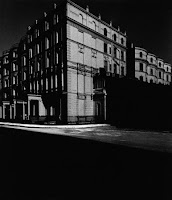
This photograph is in response to Bill Brandt's photograph because it although it is the foundations of a building, you are able to see it taking form. This photo responds to Callahan's work well in terms of the building, however, I think I could have responded to it better and chosen my idea more carefully. I think that the final edit is good because it has a lot of contrast and it is almost a 3D image as the breaks in the metal pipes join at the same vanishing point.
SCREEN GRABS
Firstly, I moved the photograph slightly to the left, where I then changed it to black and white and adjusted the levels and contrast.
After doing so, I added an extra layer, where I placed a separate photograph slightly over the top of the background image.
I adjusted the transparency and erased some of the lines of the background image. I then matched the contrast and brightness to the background photograph.


No comments:
Post a Comment